[Case 03]

30% Better Rental Matches With a Trust-First Renting Experience

UI/UX Design

Making renting less awkward than sharing a fridge with strangers

Simplifying room rentals with Rentbro

[Challenges I faced]

Tackling the Chaos of Room Rentals for both urban and nature-based properties. The room rental market is fragmented, with renters struggling to find verified, affordable listings, especially for quiet spaces near nature.
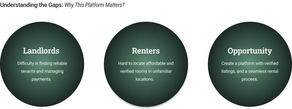
[Problem Statement]

The rental market lacks trust and transparency, leaving many unable to find suitable spaces. This struggle is even greater for those seeking quiet, peaceful environments around nature.


[Industry]

UI/UX Design

[My Role]

Lead Designer

[Platforms]

Desktop and Android

[Timeline]

January 2024- March 2024

Inspired by Airbnb - Key UX Learnings Applied

Airbnb For Nature-Based Properties

UX Principles

Studied Airbnb’s trust-first approach to reduce hesitation during decision-making.

Visual Storyteliing

Price Clarity

Transparent Reviews

Listings Hierarchy

[Properties Section]

Explore listings side by side for easy comparison.

Faster comparisons = better decisions

This design works for users when browsing.

[Business Goals]

Simplified room search, reducing drop-offs.

Verified listings and secure payments

Positive usability feedback for engagement.

[Design Decisions and Process]

[01] User Research

Conducted in-depth interviews with 10 renters and 5 Landlords

Identified key frustrations like unverified listings and unclear pricing

Analyzed NoBroker and MagicBricks for gaps in trust-building and user experience. 

[01] User Research

Conducted in-depth interviews with 10 renters and 5 Landlords

Identified key frustrations like unverified listings and unclear pricing

Analyzed NoBroker and MagicBricks for gaps in trust-building and user experience. 

[01] User Research

Conducted in-depth interviews with 10 renters and 5 Landlords

Identified key frustrations like unverified listings and unclear pricing

Analyzed NoBroker and MagicBricks for gaps in trust-building and user experience. 

[02] Ideation Phase

Brainstormed solutions addressing pain points like trust and search efficiency.

Focused on streamlining user flow and secure payment integration.

Focused on minimalistic design approach to convey brand ideology.

[02] Ideation Phase

Brainstormed solutions addressing pain points like trust and search efficiency.

Focused on streamlining user flow and secure payment integration.

Focused on minimalistic design approach to convey brand ideology.

[02] Ideation Phase

Brainstormed solutions addressing pain points like trust and search efficiency.

Focused on streamlining user flow and secure payment integration.

Focused on minimalistic design approach to convey brand ideology.

[03 Design Solution]

Designed to WCAG standards for inclusivity and accessibility

A minimalistic design approach was used for better user reach.

Imagery was selected to evoke familiarity and comfort.

[03 Design Solution]

Designed to WCAG standards for inclusivity and accessibility

A minimalistic design approach was used for better user reach.

Imagery was selected to evoke familiarity and comfort.

[03 Design Solution]

Designed to WCAG standards for inclusivity and accessibility

A minimalistic design approach was used for better user reach.

Imagery was selected to evoke familiarity and comfort.

[04] Testing & Iteration

Conducted A/B testing with 100 users, comparing the original and redesigned flows.

Gathered feedback through usability testing and refined the design based on user input.

Designed a mobile-first layout with larger touch-friendly buttons and simplified navigation.

[04] Testing & Iteration

Conducted A/B testing with 100 users, comparing the original and redesigned flows.

Gathered feedback through usability testing and refined the design based on user input.

Designed a mobile-first layout with larger touch-friendly buttons and simplified navigation.

[04] Testing & Iteration

Conducted A/B testing with 100 users, comparing the original and redesigned flows.

Gathered feedback through usability testing and refined the design based on user input.

Designed a mobile-first layout with larger touch-friendly buttons and simplified navigation.

[Outcome]

25% increase in geninue property listings.
30% reduction in drop-offs due to prominent review section
Increased rental conversion by 25% through simplified search & trust signals for frist-time users.

[Key Learnings]

Trust Is the Real Conversion Drive

Clear information, verification cues, and familiar UX patterns reduce hesitation.

Trust Is the Real Conversion Drive

Clear information, verification cues, and familiar UX patterns reduce hesitation.

Trust Is the Real Conversion Drive

Clear information, verification cues, and familiar UX patterns reduce hesitation.

Familiar Patterns Reduce Decision Fatigue

Borrowing proven marketplace interactions helped users navigate rentals with less cognitive load.

Familiar Patterns Reduce Decision Fatigue

Borrowing proven marketplace interactions helped users navigate rentals with less cognitive load.

Familiar Patterns Reduce Decision Fatigue

Borrowing proven marketplace interactions helped users navigate rentals with less cognitive load.

Clarity Beats More Filters

Well-structured listings mattered more than feature-heavy search controls

Clarity Beats More Filters

Well-structured listings mattered more than feature-heavy search controls

Clarity Beats More Filters

Well-structured listings mattered more than feature-heavy search controls

Select this text to see the highlight effect

Create a free website with Framer, the website builder loved by startups, designers and agencies.